UX / UI Case Study

Yoguruto
Thailand

A full website design and build for a real Thai yogurt franchise — delivered in 4 days using an AI-assisted, browser-first workflow.

4 Days Sprint Bootstrap 5 Vibe Code Trilingual Interactive Design
Visit Website →
yoguruto.th
Yoguruto homepage banner
Project Detail

A real brand.
A tight sprint.
A complete experience.

Yoguruto Thailand is a growing yogurt dessert franchise with physical stores across multiple regions in Thailand. This is not a concept project — the brand already had offline traction, franchise operations, and recognition from Forbes Thailand.

The task was to build a web presence from scratch that could serve real customers, international visitors, and franchise investors — simultaneously — in three languages, within four days.

TOOL

Bootstrap 5

HTML · CSS · Vanilla JS
AI-assisted (Vibe Code)

PERIOD

4 Days

Design + Build
End-to-end delivery

SERVICE

Website

Brand · Product · Franchise
3 pages delivered

ROLE

Solo

UX Strategy · Visual Design
Frontend Development

Background

Thailand's dessert café market is growing — and health-forward.

Thai consumers increasingly seek desserts that balance indulgence with wellness. Frozen yogurt and reduced-sugar options have gained traction alongside a broader café culture boom — particularly in Bangkok and university-adjacent areas such as Salaya.

International brands like Yolé ("zero dairy, zero sugar") signal where aspirational positioning is heading: clean ingredients, clear nutritional communication, and a strong digital-first presence paired with playful, premium visual identity.

💡

Key Insight

Yoguruto already had real offline momentum — physical stores, multiple regions, a franchise model, Forbes Thailand recognition. The gap was digital: no web presence to match it.

Market reference: Yolé brand

Market reference: Yolé — comparable positioning in the premium frozen yogurt space

Problem

One website.
Four very different visitors.

Without a web presence, every user intent — browsing the menu, placing a delivery order, finding a branch, or exploring a franchise investment — had no digital home. The core UX challenge was serving four distinct audiences within a single, coherent structure without overwhelming any of them.

01

Everyday Customer

Wants to browse the menu, customize an order, and find the nearest branch or delivery channel quickly. Needs minimal friction.

02

International Visitor

Chinese-speaking tourists or expats encountering the brand — needs content in their language to feel confident enough to engage and order.

03

Franchise Prospect

A potential investor evaluating whether Yoguruto is a credible opportunity. Needs clear format options, support signals, and a clear contact path.

04

Brand Discoverer

Someone encountering Yoguruto for the first time — needs to understand the brand story, product quality, and what makes it different from alternatives.

Information Architecture

3 pages.
1 clear purpose each.

The site was structured around distinct user intentions rather than a catch-all layout. Each page owns a different part of the user journey, with Home carrying the heaviest load as discovery, conversion, and retention hub simultaneously.

User Flows by Intent

Everyday Customer

Home Hot Menu Builder Order Modal

International Visitor

Home Lang Switch Menu Order Modal

Franchise Prospect

Home Franchise (nav) Type A / B Contact

Brand Discoverer

Home Our Story Menu
yoguruto.th
Home
Banner Carousel
Hot Menu
Promotions
Yogurt Builder ★
Branch Finder
Franchise Section
Menu
Yogurt
Ice Cream
Croffle
Our Story
Origin Story
How We Make It
Brand Values
Franchise CTA

Global — Across All Pages

Sticky Navbar Language Switcher (TH / EN / 繁中) Franchise CTA Pill Delivery Modal Footer
Direction

4 principles guided every decision.

With four distinct user intents and a 4-day window, every design choice needed a clear anchor. These principles weren't written after the fact — they were the filters applied while building.

🎯
Personalized

The Yogurt Builder makes every visit feel active and unique. Users construct their order — flavor, toppings, sweetness — with live calorie and price feedback. No two cups are the same.

🌐
Accessible

Thai, English, and Traditional Chinese — fully implemented across all three pages with persistent language preference. Four delivery platforms meet users where they already order.

Playful

The brand's warm personality shows in hover animations, sweetness character illustrations, badge styling, and a cream-yellow-red color system that feels fresh and dessert-forward — not clinical.

🏛️
Credible

The franchise section uses a deliberately dark-background treatment to shift tone from casual consumer to serious investor conversation. The Our Story page reinforces the brand's real history and values.

Design System

Warm, fresh,
and unmistakably
Yoguruto.

The visual system was derived from the brand's existing identity — not imposed on it. Every token reinforces the same core feeling: natural, indulgent, and approachable.

Typography

sofia-pro-soft

Primary brand typeface — rounded, warm, friendly

H1 — Brand Title 800 · clamp(1.7–2.4rem)
Section Heading 700 · 1rem
Body text, descriptions 400 · 0.875–1rem
SECTION KICKER 700 · 0.68rem · uppercase

Colour Palette

Brand Brown
#5a321b
Brand Yellow
#f7c948
Brand Red
#c81f2d
Cream BG
#fef9ee
Subtle Text
#8b6d59
Brown Dark
#3f2414

Key UI Patterns

Glassmorphism Navbar

Sticky · blur(18px) · rgba white bg

79.-

Price badge · Red pill · Absolute top-left

Glass Product Card

Glass bg · radius-24 · soft shadow

Order now!

CTA button · Brown pill · Full-width on mobile

Home Page

The homepage does the most work.

As the primary landing destination, Home needed to orient all four user types within seconds — without overwhelming any of them. The page was structured as a progressive reveal: broad brand statement → specific product → engagement → conversion.

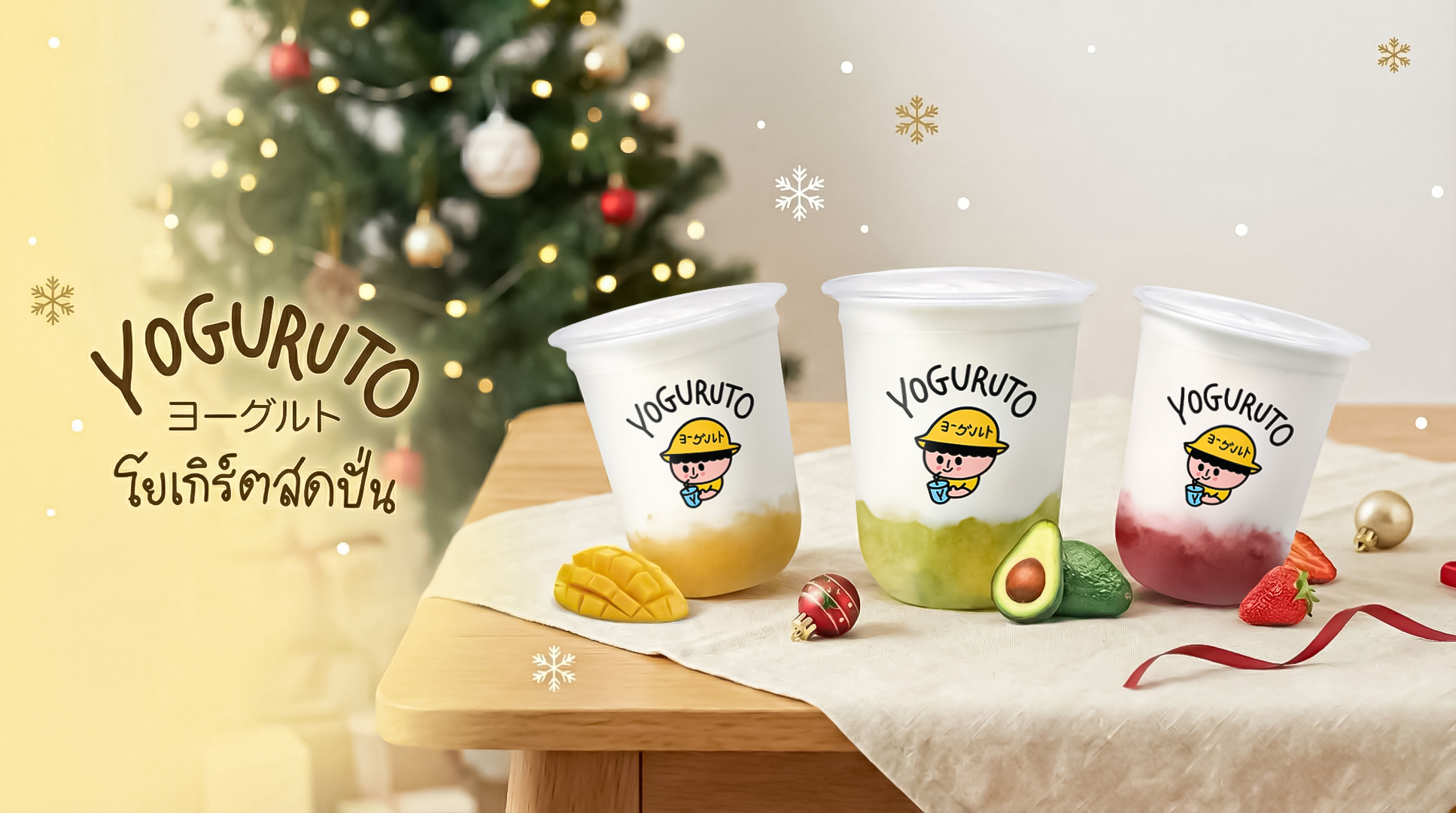
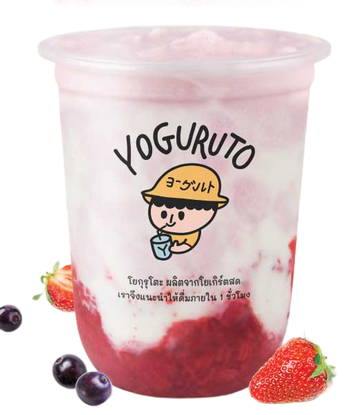
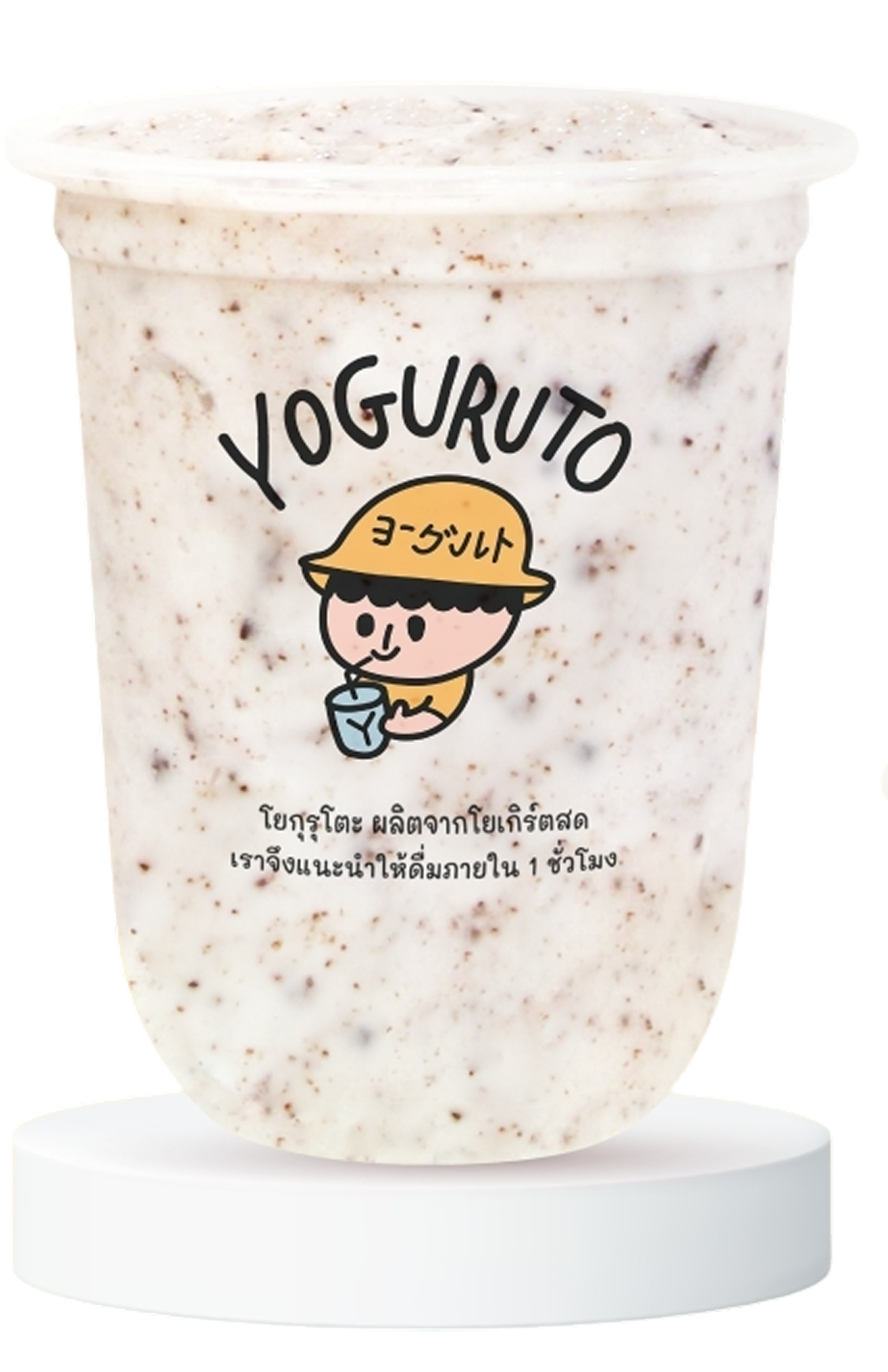
3-slide hero carousel — cycles between Fresh Yogurt, Ice Cream, and Crispy Croffle. Communicates product range on arrival before any scrolling. Auto-plays at 3-second intervals.

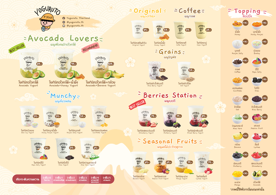
Hot Menu (4-column grid) — top-selling items with price badges and hover-zoom animation. Provides quick product context before users scroll to the full builder experience.

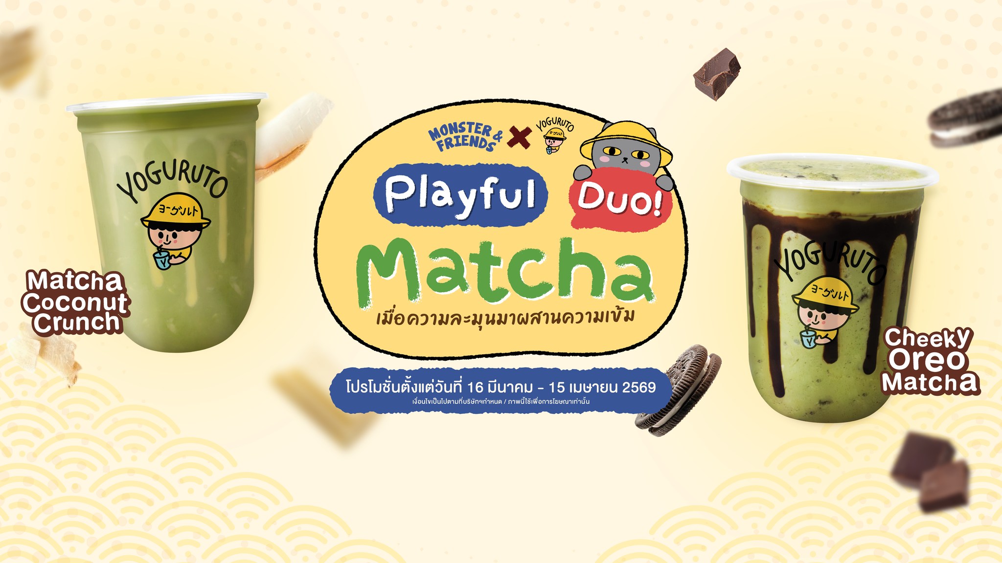
Promotions (6 cards) — rotating offers including Buy 2 Get 1 Free, Member Discount, Weekend Deal, Seasonal Special. Drives repeat visits and rewards loyalty.

Franchise pill in navbar — persists across all pages, ensuring investor prospects can navigate directly to the franchise section regardless of where they first land.

yoguruto.th / home
Yoguruto homepage banner 2

Hot Menu Section — 4-column grid with price badges & hover-zoom

Yogurt Signature
Yogurt Signature
79.-
280 cal. · sugar 14g
Yogurt Mango
Yogurt Mango
69.-
255 cal. · sugar 11g
Mixed Berry Yogurt
Mixed Berry Yogurt
59.-
240 cal. · sugar 10g
Summer Berry
Summer Berry
59.-
230 cal. · sugar 9g
Yogurt Builder

The hero interaction: build your own cup.

The Yogurt Builder is the most complex and differentiated feature on the site. It transforms passive menu browsing into an active, personalized experience — directly reflecting the brand's core value of customization while giving users a reason to stay and engage.

4 yogurt flavors (Original 49฿ · Honey 59฿ · Purple Rice 59฿ · Oat 59฿) — each with individual calorie counts. Selecting a flavor updates the live cup preview image in real time.

6 toppings, max 3 (10฿ each) — a deliberate constraint that prevents decision paralysis while offering meaningful variety. Exceeding the limit shows an inline warning instead of silently blocking the selection.

5 sweetness levels (0%–100%) — with a character illustration that changes expression to reflect the selected level. Adds delight and clarity simultaneously without needing text alone.

Live summary panel — total calories and price update on every selection change. "Order now" triggers the delivery modal, completing a full ordering path without leaving the page.

Yogurt Flavors — Live Cup Preview

Original
Original
49.-
210 cal.
Honey
Honey
59.-
240 cal.
Purple Rice
Purple Rice
59.-
245 cal.
Oat
Oat
59.-
235 cal.

Toppings — Choose up to 3 (10฿ each)

Pearl
Pearl
45 cal.
Brown Sugar Konjac
Brown Sugar Konjac
38 cal.
Honey Konjac
Honey Konjac
30 cal.
White Konjac
White Konjac
28 cal.
Taro Konjac
Taro Konjac
32 cal.
Jelly
Jelly
36 cal.

Sweetness Scale — Character changes at each level

0% sweetness
Not Sweet
0%
25% sweetness
Less Sweet
25%
50% sweetness
Light Sweet
50%
75% sweetness
Normal
75%
100% sweetness
Extra Sweet
100%
Find & Order

Where to find us.
How to get it.

Two complementary conversion mechanisms sit at the bottom of the Home page — one for in-person visits, one for delivery — ensuring neither user path is left without a destination.

Branch Finder — map preview of the main Mahidol Salaya branch with a regional breakdown across 5 areas (Central · North · South · East · West). "Go to nearest branch" links directly to Google Maps.

Delivery modal (4 platforms) — a single "Order online" tap (available from the navbar, the Builder, and multiple CTAs) opens a modal with Grab, LineMan, RobinHood, and ShopeeFood shown side by side.

UX decision — modal over page: Keeping delivery within a modal rather than routing to a new page prevents drop-off. All four platforms are shown simultaneously with no preference hierarchy — the user chooses.

Branch map preview

Delivery Platforms — All 4 shown simultaneously in modal

RobinHood

ROBINHOOD

LINE MAN

LINE MAN

Grab

GRAB

ShopeeFood

SHOPEE FOOD

Franchise

Credibility
by design.

The franchise section deliberately breaks from the rest of the page's cream-and-yellow palette. It uses the brand-brown as a full-section dark background — signalling a shift in tone from casual consumer experience to serious business conversation.

Two franchise formats — Type A (compact kiosk, low investment, easy to start) and Type B (full store, complete menu, high-potential locations) — address different investor profiles without requiring a dedicated page.

Persistent "Franchise" pill in navbar — present across all three pages. Franchise prospects who land on Menu or Our Story are never more than one click away from the investment section.

UX decision — same page, different tone: Embedding franchise on the homepage exposes investor-relevant credibility signals (product quality, customer interest, brand consistency) alongside consumer content — reinforcing the pitch without a cold landing page.

Franchise Type A — compact kiosk

TYPE A

Compact Format

Small kiosk · Low investment · Full support system included

Franchise Type B — full store

TYPE B

Full Store

Complete menu · Full brand experience · High-potential sites

Our Story Page

The brand behind the cup.

The Our Story page follows a storytelling structure borrowed from craft and artisan brands — specifically drawing on the narrative approach seen in references like Ghia ("Born from a love of ritual"). The goal was to turn what could be a generic "About" page into a genuine brand argument.

Origin Story — "Started from a love of yogurt." Frames the brand as authentic and founder-driven rather than manufactured. Positions the product as a labour of care, not a mass-market SKU.

How We Make It (4 craft cards) — Fresh milk · Live probiotic culture · Seasonal fruit toppings · No preservatives. Each card addresses a specific quality concern health-conscious consumers might hold before ordering.

4 brand values — Quality first · Customizable · Delivered to you · Eco-friendly. These values mirror the 4 design direction principles exactly, creating coherence between what the brand says and how the UX behaves.

Franchise CTA closes the page — after the brand story lands, the About page loops franchise prospects back into the conversion path — reinforcing the brand's growth trajectory and completing the persuasion arc.

Yoguruto — About page

Reference Influence

Ghia brand reference

Ghia brand's narrative flow — origin story → craft process → human touch → invitation — informed the section sequencing of the Our Story page. The pattern works because it earns trust before asking for action.

AI-Assisted Workflow

"Vibe Code" — designing in the browser with AI.

"Vibe coding" is a methodology where design decisions are made and implemented simultaneously in the browser, using AI as a generative collaborator. It collapses the typical design → handoff → build cycle into a single continuous loop.

For a 4-day sprint with real brand assets and real delivery expectations, this was a deliberate strategic choice — not a shortcut. AI accelerated execution; human judgment drove every decision that mattered.

Result

3 fully responsive pages · Trilingual i18n · Interactive Yogurt Builder · 4 delivery platforms · Franchise section — shipped in 4 days with zero external dependencies beyond Bootstrap.

What AI Accelerated

Bootstrap component scaffolding i18n strings (TH / EN / 繁中) Builder JS logic (live calc + state) Responsive CSS iterations CSS custom properties system Animation & transition timing Modal interaction patterns Copy variation drafts

What Required Human Judgment

Brand tone & voice decisions Information hierarchy Which features to include 3-topping constraint rationale Franchise visual treatment Competitive & market research Asset curation & layout Cross-language UX review IA structure decisions
Outcome

What 4 days delivered.

A complete, production-quality web presence for a real brand — covering all four user intents, in three languages, with a fully interactive ordering flow. Every feature maps directly to a verified business or user need.

3
Pages built
3
Languages
4
Delivery platforms
4
Days to ship

What Worked Well

The Builder as the anchor feature

Personalization creates investment in the product before purchase. The Builder gave users a reason to spend time on the page, which compressed the distance between discovery and intent.

Franchise embedded alongside consumer content

Placing franchise on the homepage let investor prospects see product quality, customer engagement, and brand energy in context — a more convincing pitch than a cold, isolated franchise landing page.

Trilingual i18n without a framework

A lightweight vanilla JS implementation — a single i18n object with three locale keys, rendered on every DOM update — kept the site zero-dependency while supporting full language switching with localStorage persistence.

What I'd Revisit

Prototype before building

Vibe coding worked for speed, but a low-fidelity Figma prototype first would have surfaced mobile layout conflicts earlier — particularly in the Yogurt Builder's multi-column layout.

Builder scrolling on mobile

Stacking flavor → toppings → sweetness → summary vertically creates a long scroll on small screens. A step-based flow (1 of 3 → next) would reduce cognitive load and improve completion rate.

Accessibility audit

Focus states and ARIA labels were included but not tested with a screen reader. A dedicated accessibility pass — especially on the Builder's interactive elements — would be the next milestone.