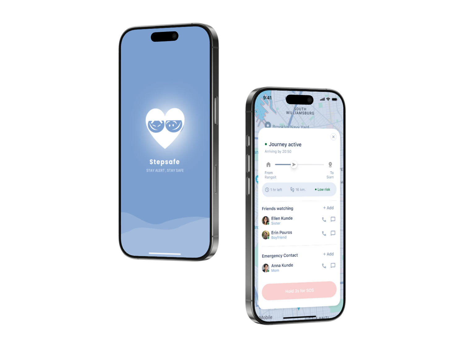
StepSafe — Mobile Safety App
A safety companionfor the moments that matter most.
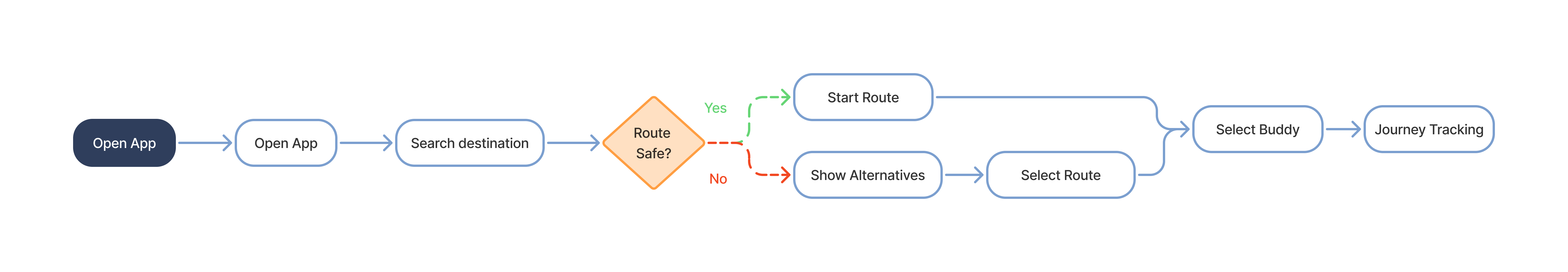
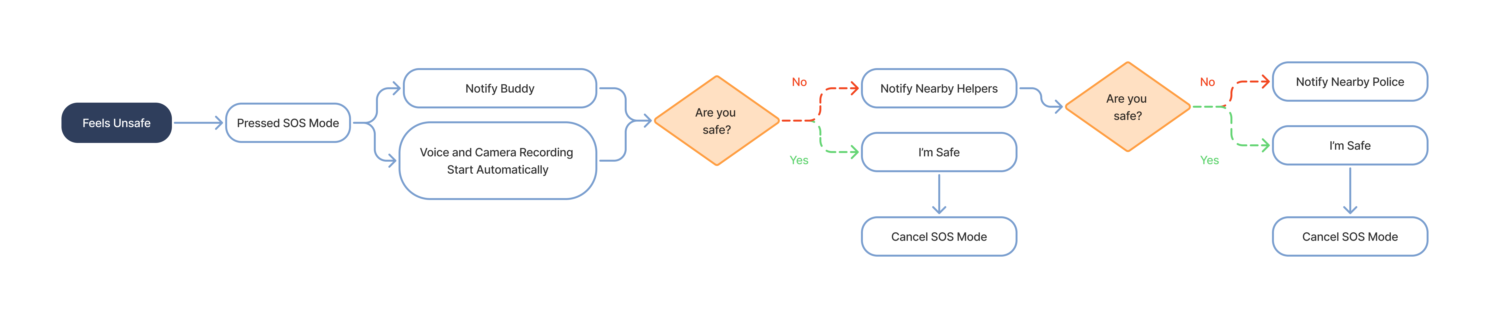
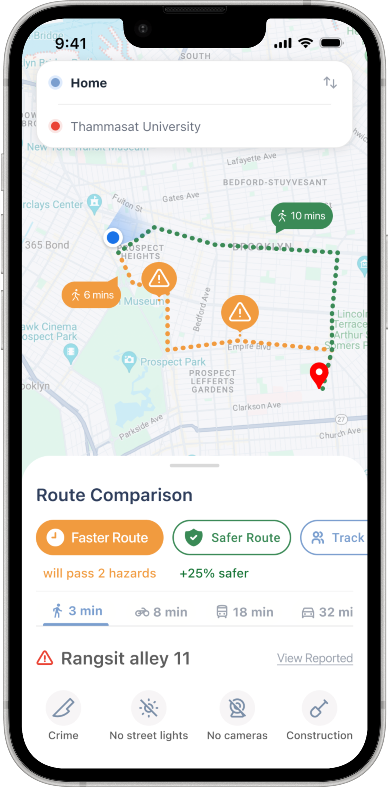
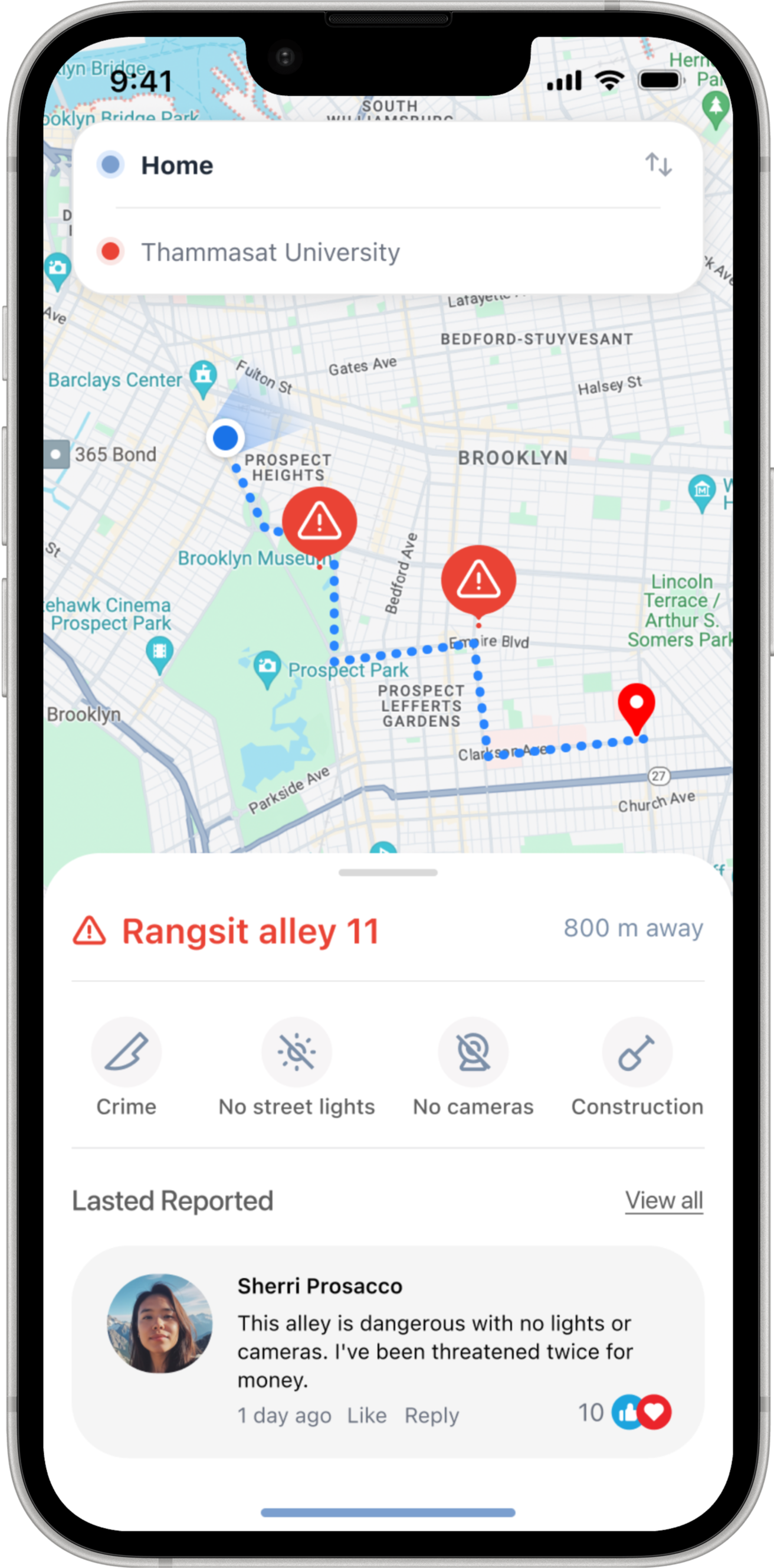
Stepsafe is a mobile safety app for solo travelers — helping users stay aware, connected, and supported before a situation becomes an emergency.
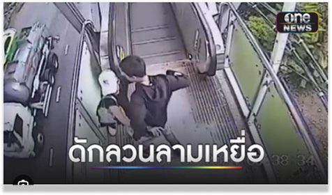
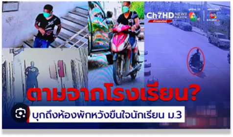
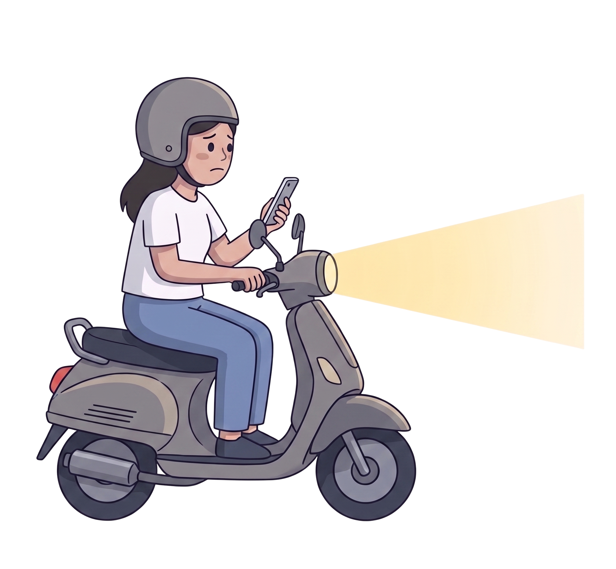
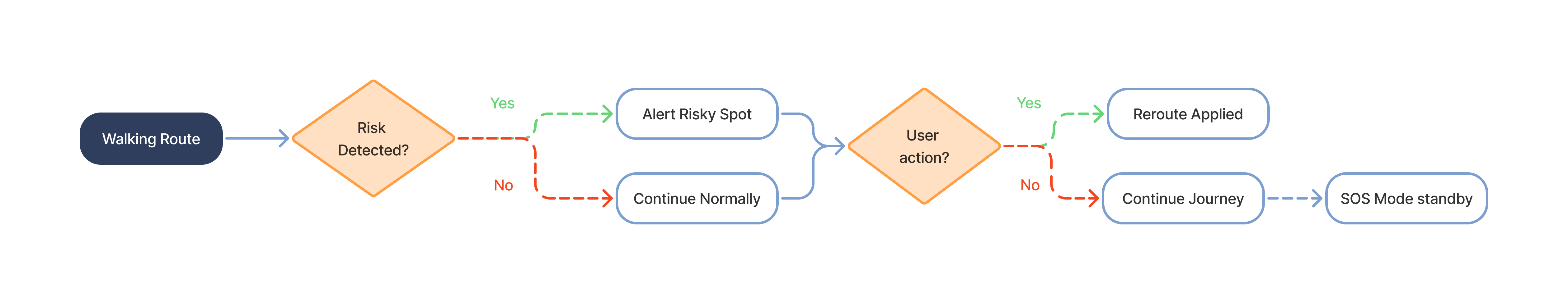
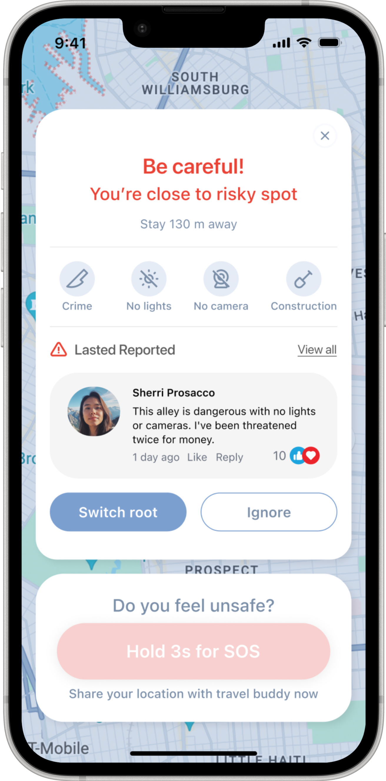
The fear often starts earlier: the unfamiliar street, the poorly lit alley, the moment something doesn’t feel right.
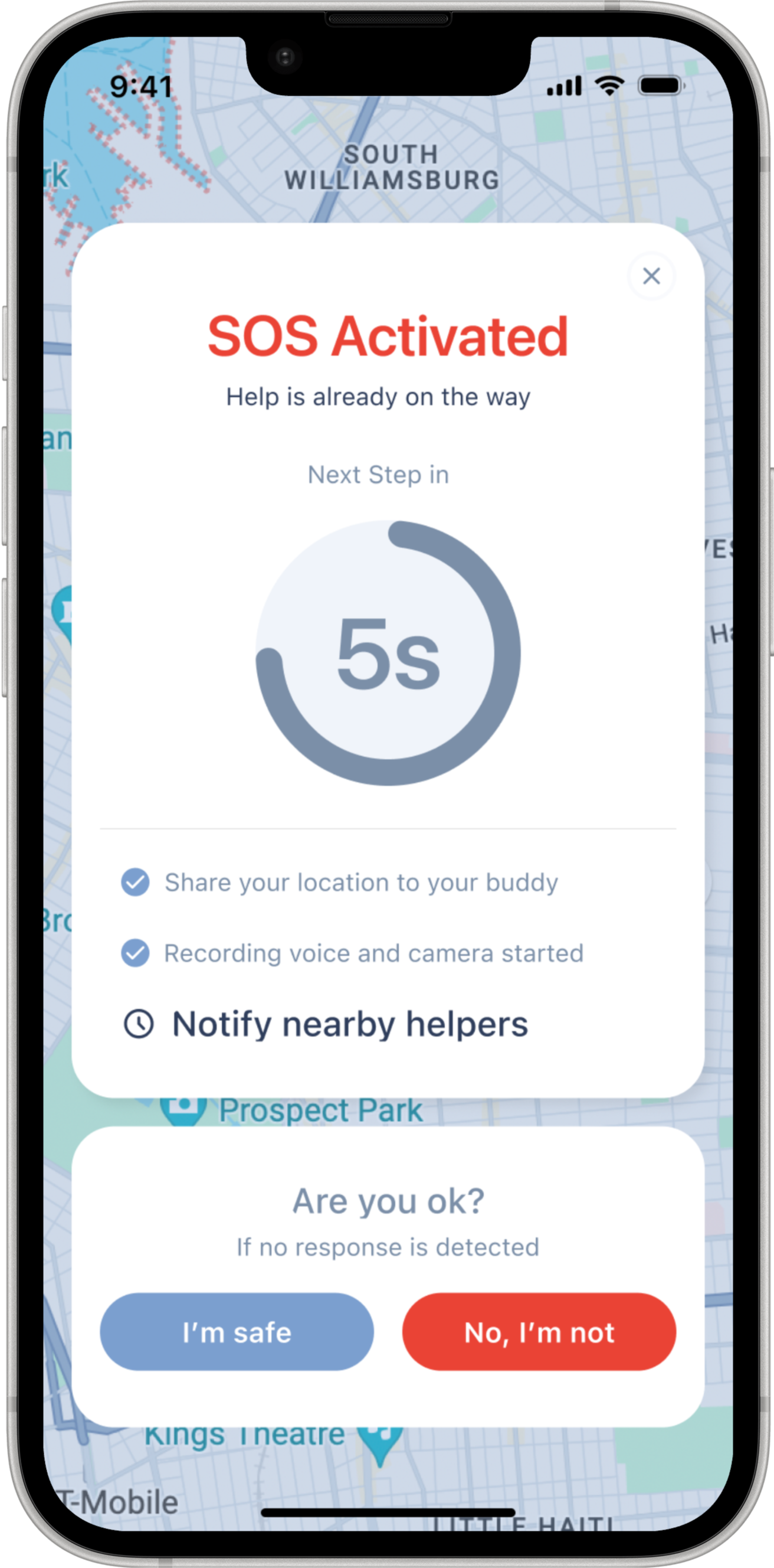
Stepsafe focuses on prevention — safer route awareness, live journey sharing, and a trusted support layer — so users are never caught off guard.
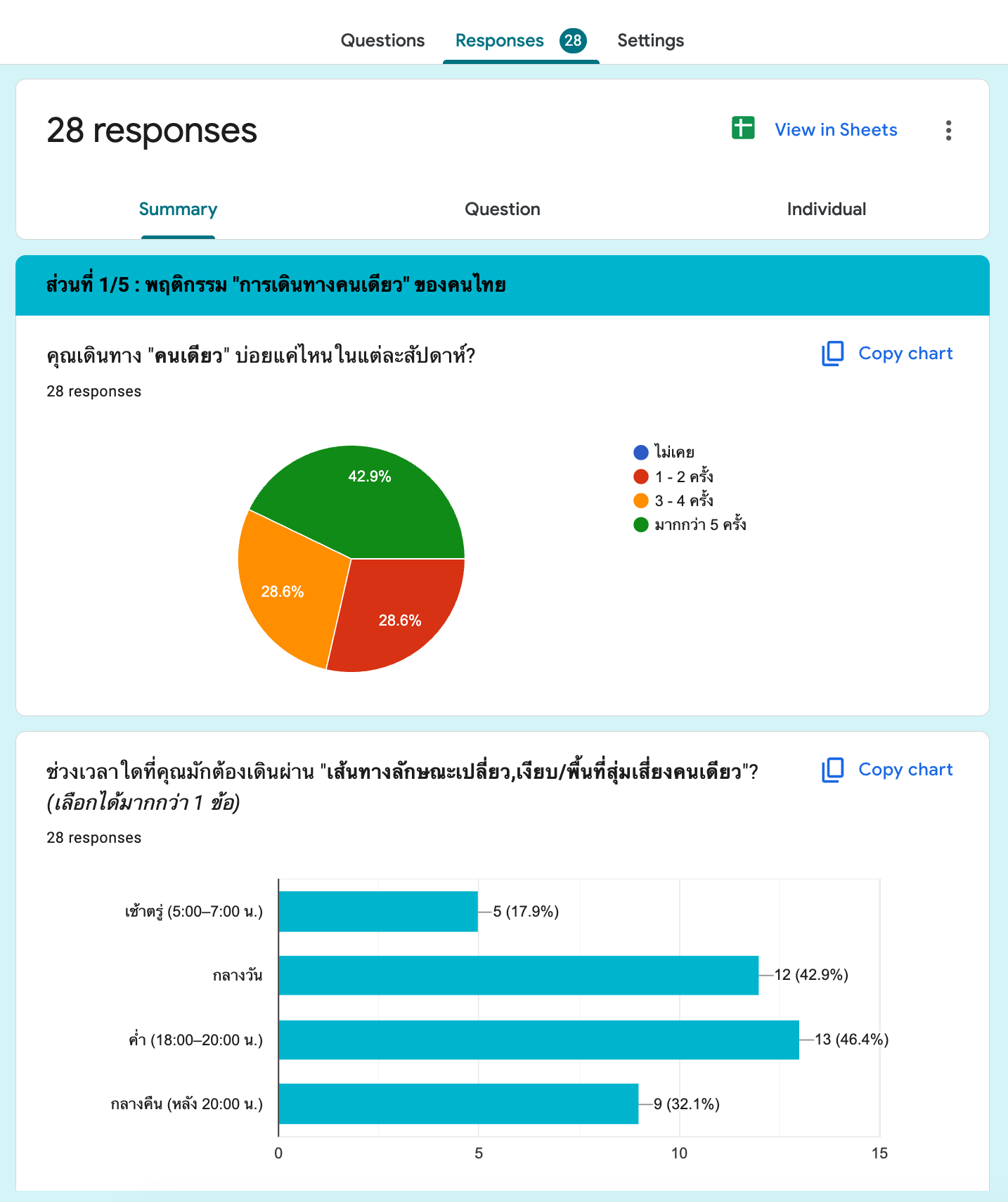
Duration : 1 month