


THINK & FEEL
- กังวลไม่มีใครรู้ว่าตัวเองอยู่ที่ไหน
- ถ้าเจอคนแปลกๆ จะทำไงดี?
- ไม่รู้เส้นทางที่ปลอดภัยกว่า
- โทรหาใครดีไหมนะ
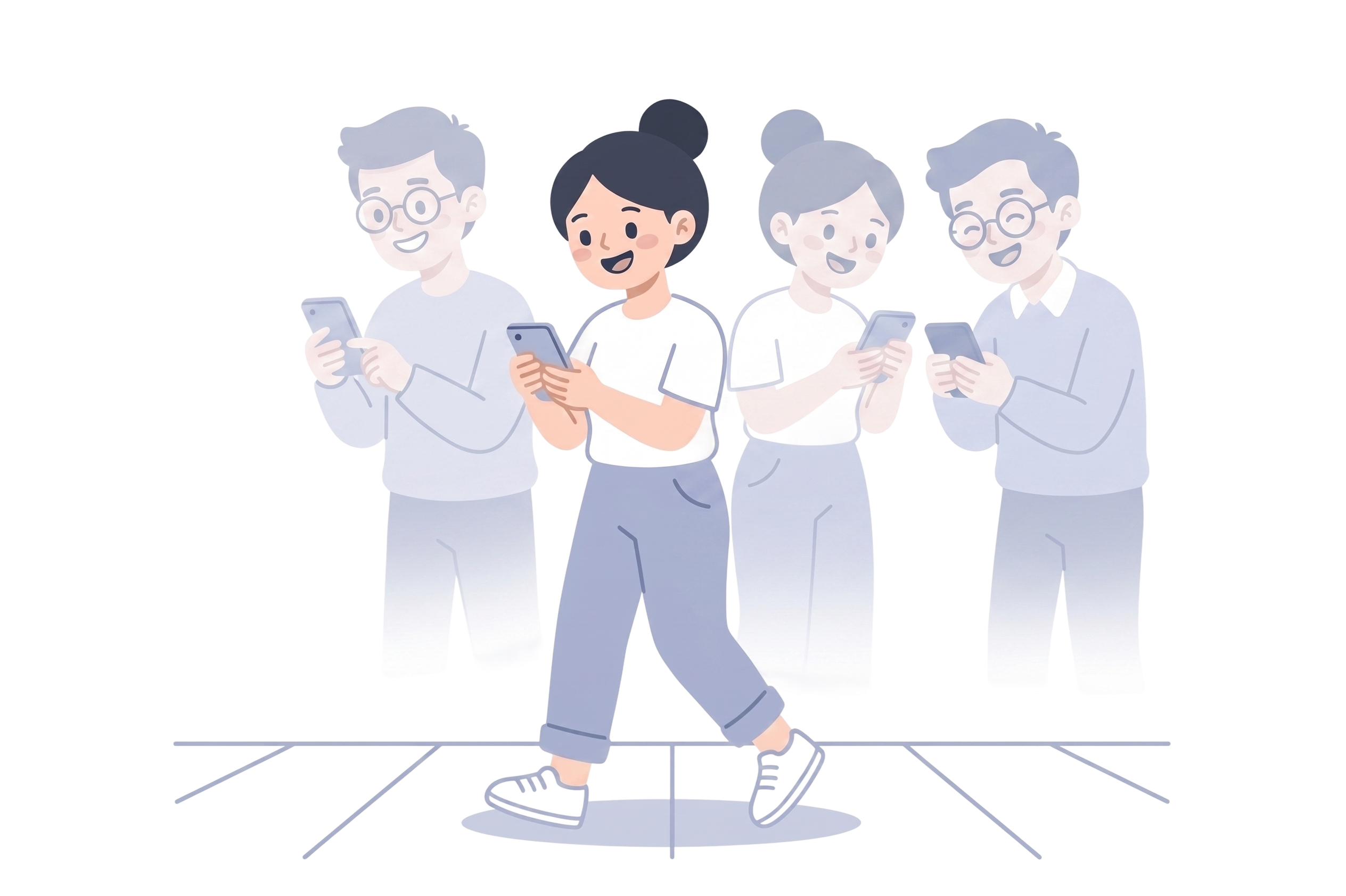
- จะมีใครเดินทางเดียวกันไหม?
StepSafe helps solo travelers feel safer, more aware, and supported — before anything goes wrong.
Stepsafe is a mobile safety app designed for solo travelers and everyday journeys. It helps users stay aware, connected, and supported before situations become emergencies.
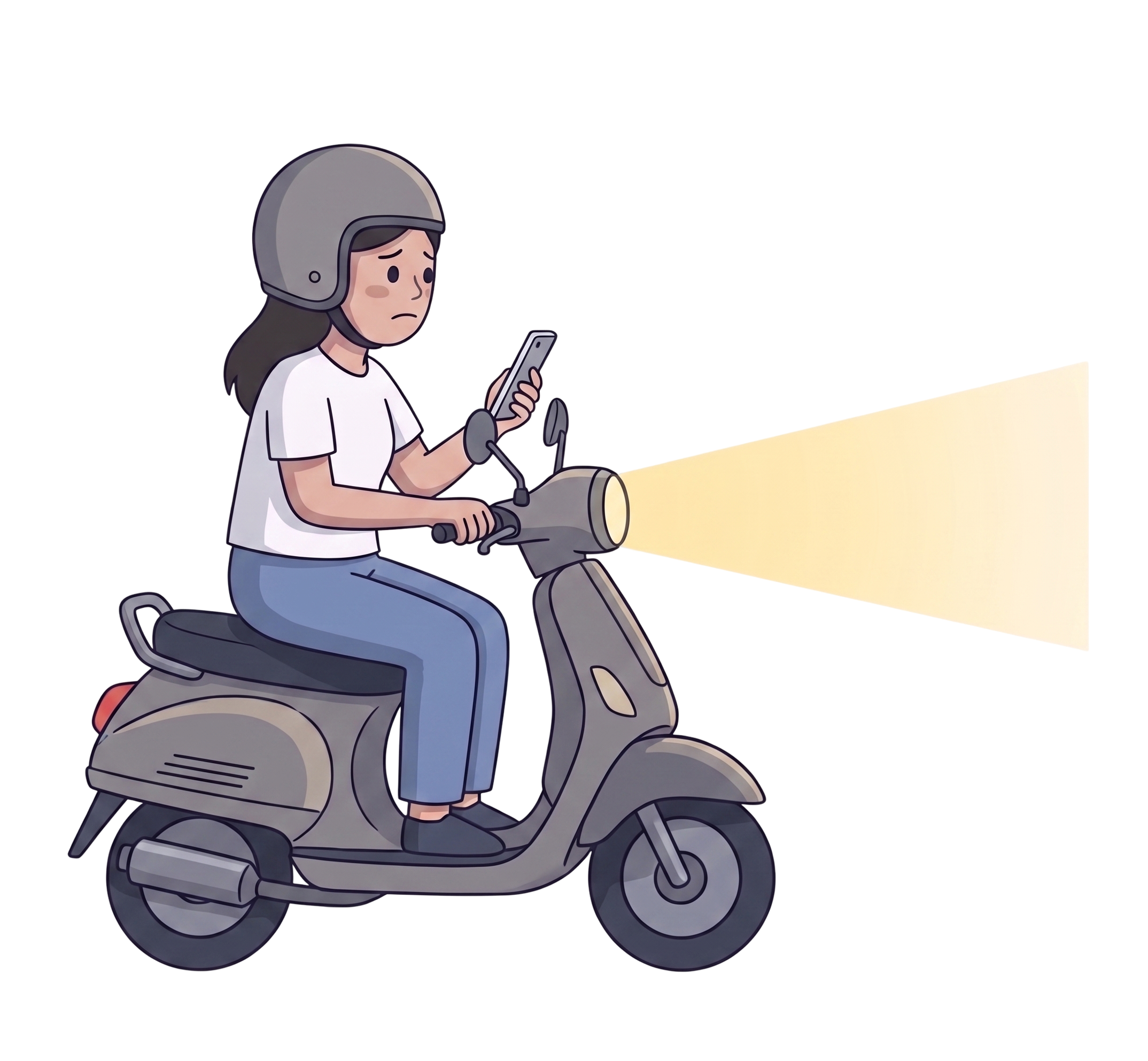
The real fear often starts earlier — the unfamiliar street, the poorly lit route, or the moment something doesn’t feel right.
Instead of reacting only after danger happens, Stepsafe focuses on prevention through safer route awareness, live journey sharing, and trusted emergency support.
Duration : 1 month
Over 500 areas across Bangkok have been identified as high-risk zones — including poorly lit streets, dead-end alleys, and spaces without surveillance coverage.
 View source
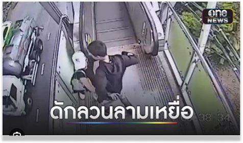
Incidents frequently occur in transitional spaces — escalators, pedestrian routes, and areas where people move alone and predictably.
 View source
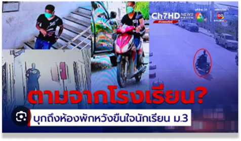
Victims are often followed from familiar, everyday locations. The route from somewhere safe can quickly become somewhere it isn’t.
 View source
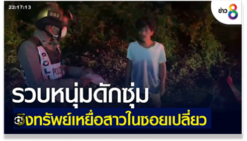
Poorly lit alleys and secluded paths remain among the most common locations for incidents targeting solo travelers at night.
These examples are based on real user behaviors and patterns observed from online community discussions, where people share safety warnings and risky locations with each other.
เคยไปสมัย 30 ปีที่แล้ว ขี่มอเตอร์ไซค์ไปเที่ยวกัน ทางลูกรังน่ากลัวสุดๆ — ตลอดทางคิดแต่เรื่องกลับบ้าน คิดถึงพ่อแม่ ประสบการณ์นั้นไม่มีวันลืม
I went on a group motorcycle trip 30 years ago. The gravel road was terrifying — all I could think about was getting home, my parents. That experience never left me.
เคยโดนตาม 2 ครั้ง เมื่อ 4 ปีที่แล้ว คนขับมอไซค์ตามมาตลอด ประสบการณ์แบบนี้มันติดอยู่ในใจตลอด
I’ve been followed twice. It happened about 4 years ago — someone on a motorcycle both times. That kind of experience stays with you.
ถนนสายนี้ ไม่มีไฟตามทางเลยสักดวง กลางคืนมืดสนิทมาก เป็นเส้นทางที่มีลุ่มเยอะ ถนนครุกระ
No street lights on this road at all. Pitch black at night. Lots of bushes on both sides — you feel completely alone.
ถนนเส้นนั้นมันอันตรายนะ มันเคยมีเหตุการณ์เกิดขึ้นบ่อยมาก พี่กับเพื่อนเคยเจอถูกรถตาม ทั้งบีบแตร ร้องกรีด จนมีคนช่วยได้
That road is genuinely dangerous. My friend and I were once followed by a car. We had to honk and scream until someone stopped to help.
ฝากเป็นกระบอกเสียงให้หน่อยนะครับ คนในพื้นที่ต้องการให้มีคนพูดแทน
Please amplify this — the people living here need someone to speak up for them.
เส้นทางนี้อันตรายมากค่ะ
This route is very dangerous.
The goal was to design a mobile safety companion that works before an emergency happens — giving solo travelers real-time risk awareness, safer route options, and a support layer they can actually rely on.
Following a Design Thinking methodology, research was grounded in direct user input: an online survey with 28 participants and twelve 1:1 interviews — mapping real fears, avoidance behaviors, and the decisions people make when something feels off.
A structured survey targeting women who travel alone regularly — mapping fears, avoidance behaviors, and the decisions they make under uncertainty.
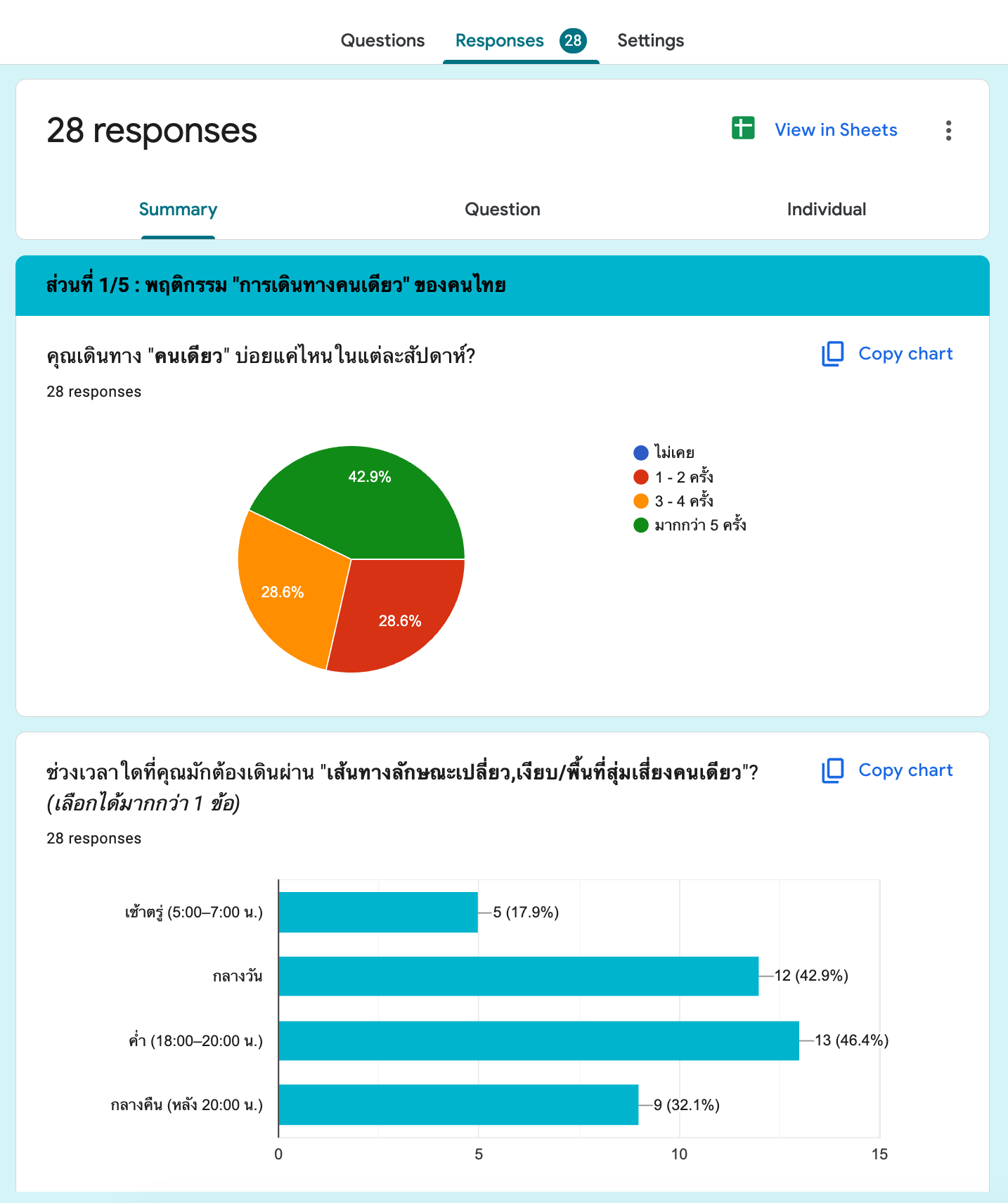
Twelve online interviews to go beyond survey data — understanding the emotional reality of solo travel and the workarounds people already use to feel safer.
Feel alert every time they walk alone through isolated areas
Take a longer route to avoid a path that feels unsafe
Contact someone they know — not emergency services — when afraid
Identify unlit alleys as the most dangerous environment type
Design implications
Safety decisions happen before emergencies.
Users wanted support while planning routes — not only after something went wrong.
People trust personal support first.
Most users preferred reaching trusted contacts before emergency services.
Users already choose safer routes.
When safety information was visible, users naturally adjusted their decisions.
The biggest gap exists before emergencies.
Most travel anxiety happened in uncertain moments — before situations became dangerous.

Nuch — 21 years old คุณนุช อายุ 21 ปี
Round 2 — หลังได้ข้อมูลจาก Survey 28 ท่าน | ผู้หญิงที่เดินทางลำพังเป็นประจำ อายุ 20–55 ปี อาศัยอยู่ใน กทม. และปริมณฑล
21 ปี · นักศึกษา · กทม.
เดินทางคนเดียวเป็นประจำ
From fragmented, anxiety-driven moments to a calm and confident journey — StepSafe redesigns every touchpoint where safety is felt.
Current experience — fragmented information, unclear safety signals, and high emotional anxiety.

StepSafe experience — clear risk awareness, proactive support, and emotional confidence at every step.

Three principles drove every design decision.
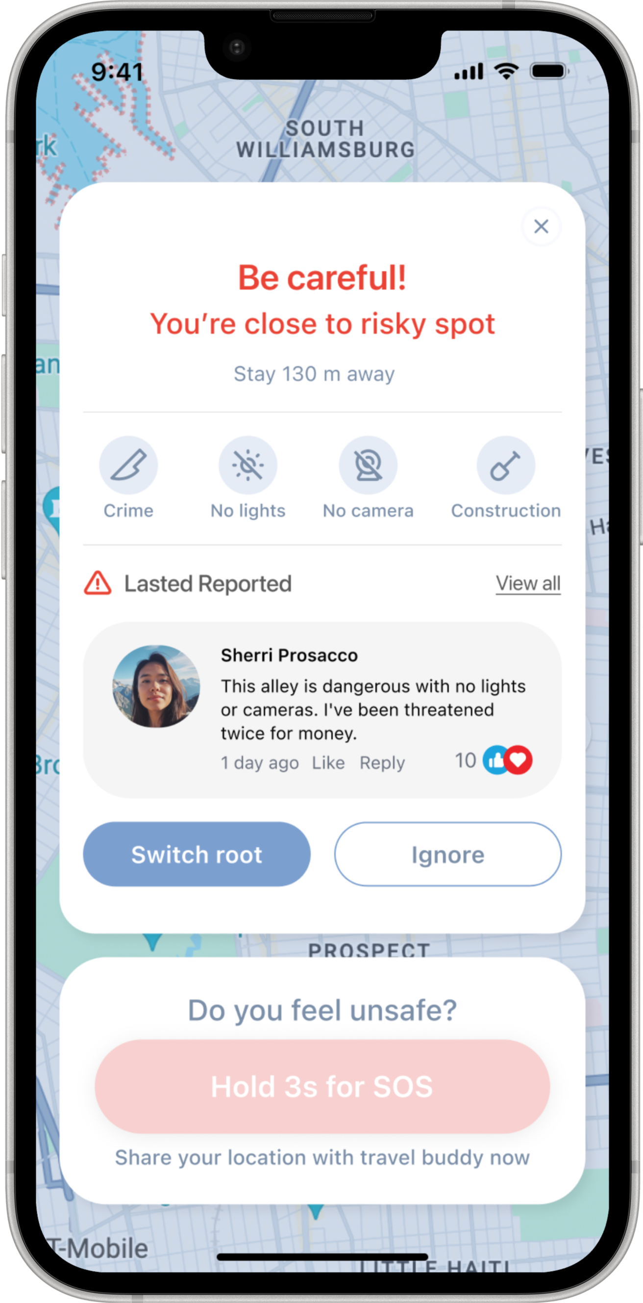
Risk had to be visible at the planning stage — not delivered as a notification after the user was already somewhere unsafe.
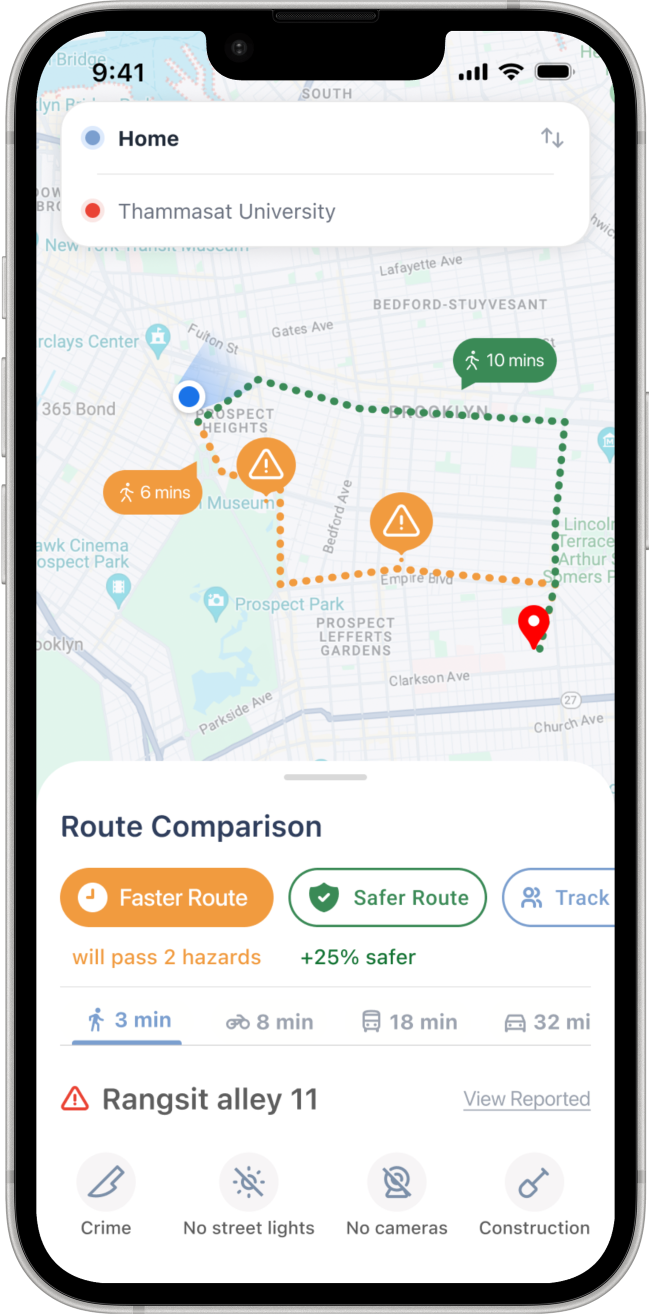
Route comparison was redesigned to lead with safety signal, not travel time. A better option always sits alongside the riskier one.
The support layer mirrors real behavior: trusted network first, emergency services last — never the reverse.

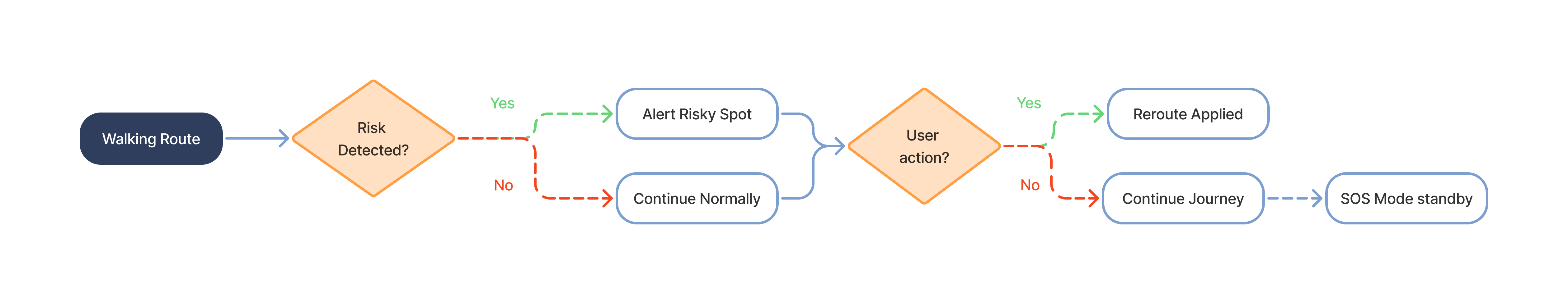
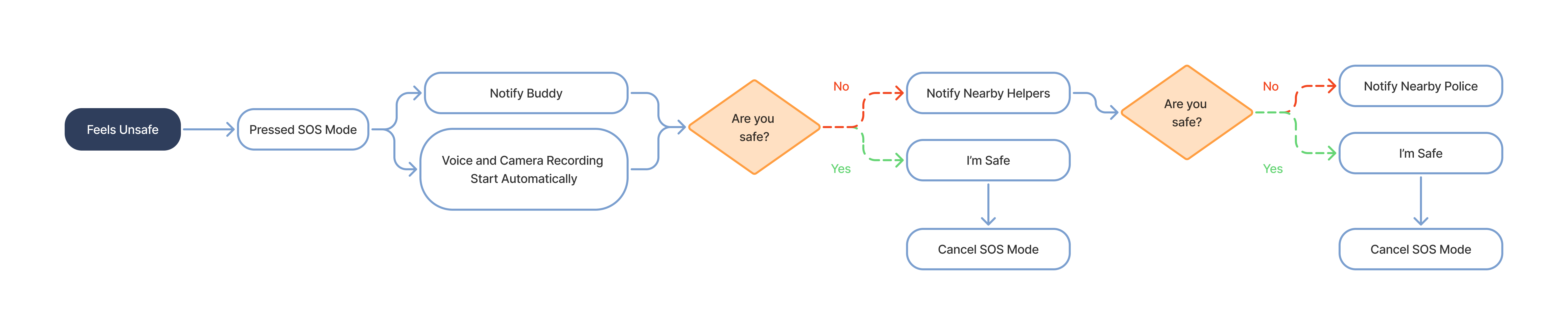
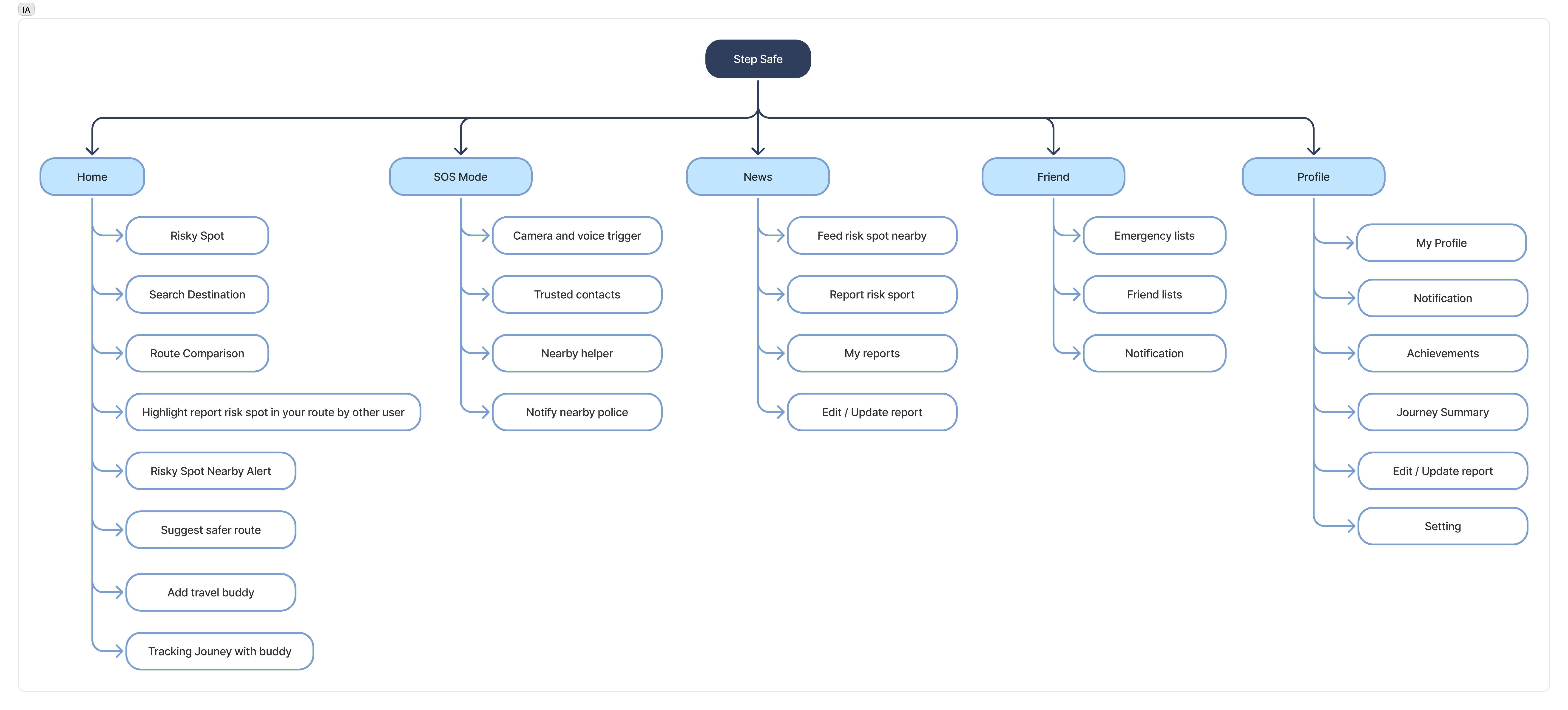
Four core flows that show where decisions are made, how safety features interact, and how the product escalates support progressively.
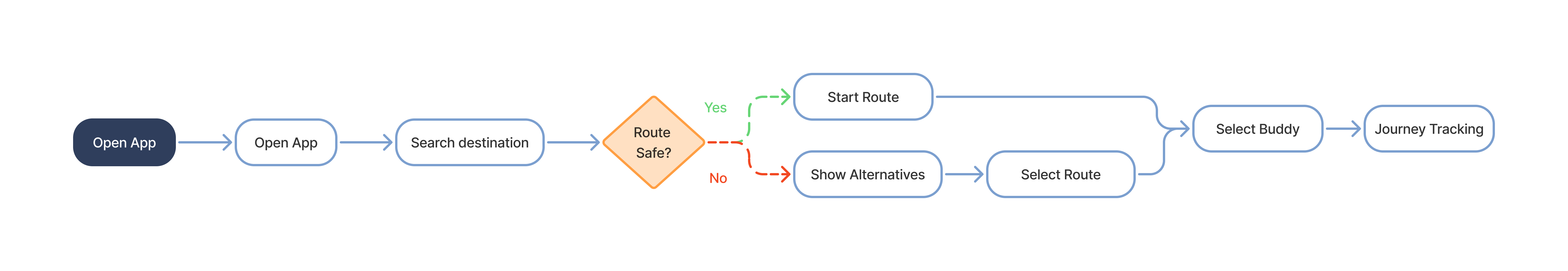
A structured view of StepSafe's features and navigation before user flows.
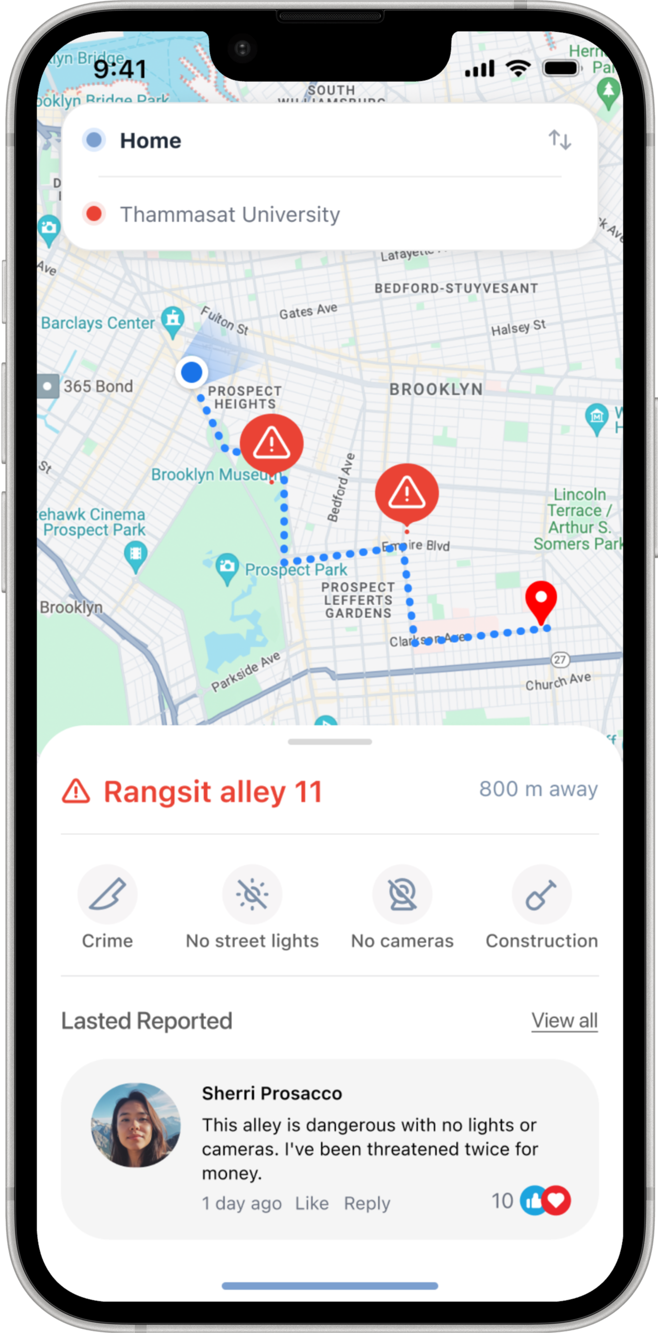
Route Comparison shows the risk level of each path alongside travel time — so a safer choice is always visible before the user sets off.
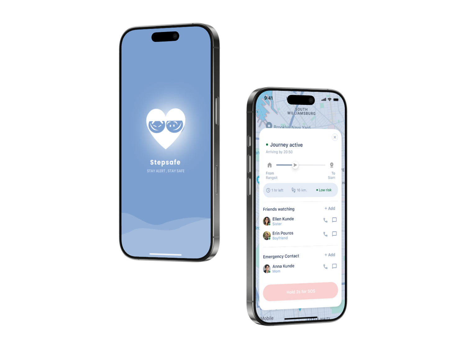
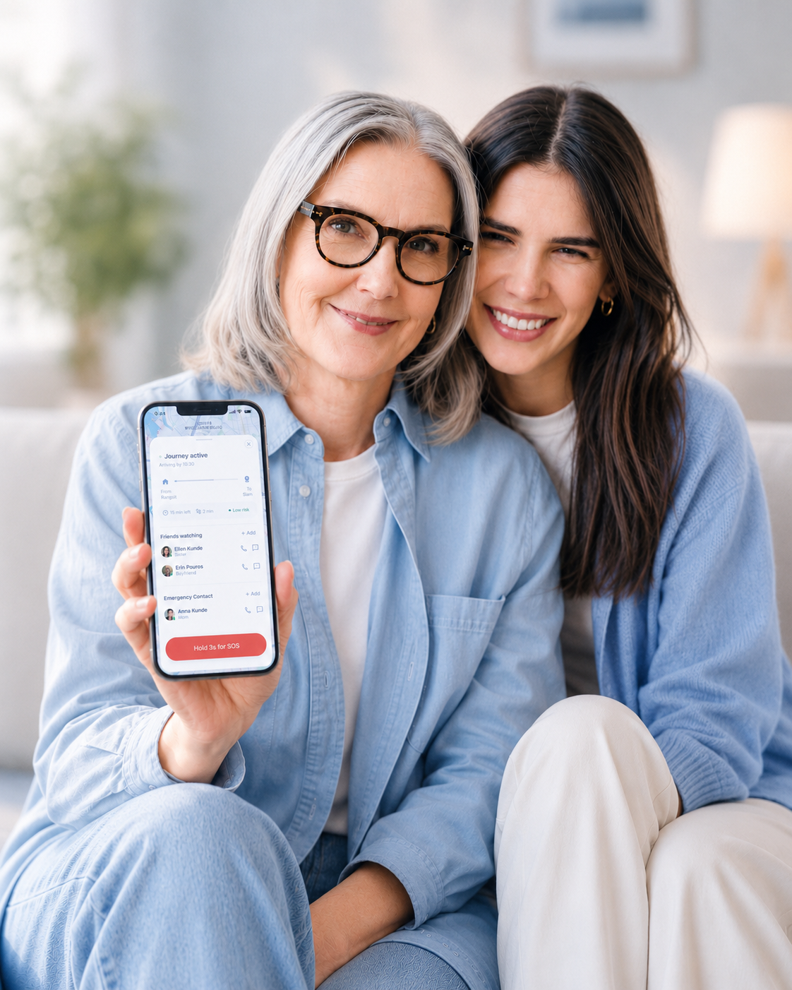
Track Me shares your live location and ETA with selected contacts. If a check-in is missed, they're quietly alerted — no panic, just presence.
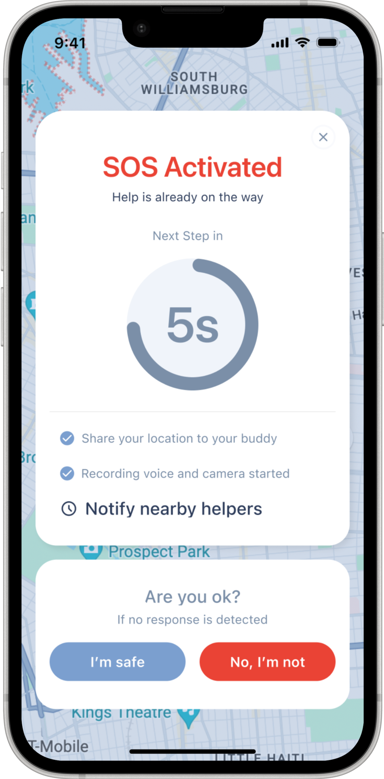
Three layers of support, scaled to the situation. Each layer includes a countdown timer — the user can cancel or escalate at any point. If there is no response in time, the system assumes risk and automatically advances to the next layer.
Share your live route with selected contacts. When SOS is held for 3 seconds, the device automatically begins recording audio and video — and alerts your trusted network immediately.
If the user does not respond, StepSafe automatically turns on voice and camera recording to capture real-time evidence and context.
Notifies the nearest police station with your live location. One action. Always visible — never buried.
Every token, component, and color choice reinforces the same principle: fast comprehension, low cognitive load, and emotional reassurance.
Safety experiences shouldn’t feel cold or intimidating. Instead of relying only on alerts and warnings, StepSafe introduced a companion character designed to guide, reassure, and support users throughout uncertain moments.
The mascot acted as a softer emotional layer — helping safety feedback feel calmer, more approachable, and easier to trust during travel.


Five key screens — from risk awareness to emergency escalation.
A high-level view of how StepSafe screens connect across route planning, tracking, risk awareness, and support escalation.
